
We’ve all sat through unreadable, confusing, boring, or even misleading presentations with their associated data visualizations. We’ve all been puzzled or confused by some of the charts we see on the web. The latest example is data visualizations about the COVID-19 pandemic. Above is a humorous chart that is a critical response.
Poor or mediocre data visualizations are caused by a lack of thoughtfulness about presenting data in a chart that will resonate with audiences. Sometimes the problem is that the author of the data visualization is using a chart to deliberately mislead the audience. In this slideshow, I’ll show examples of the worst offending data visualizations. For each example, I’ll describe how to make the data visualization more powerful, so that it will communicate your message better. Source: XKCD
Bad design vs. Good design
 The two data visualizations on the left display exactly the same data. The bad design chart suffers from a number of problems including:
-Annotating every data point with its value. The annotations overwhelm the chart and hide its message.
-The y-axis label is an abbreviation that’s not easily understood.
-The y-axis does not start at zero.
-The x-axis numbers suggest an increasing range of values but are in fact the number of a month.
-The year associated with the months is not shown.
-The legend and the time series symbols are too far out of the way.
The good design chart is more visually appealing and avoids the problems by:
-Formatting the three time series to stand out prominently and avoiding a legend.
-Replacing all the data point annotations with a table of values. Now the values are still available but don’t detract from the chart.
-Spelling out the y-axis label.
-Starting the y-axis at zero.
-Labeling the x-axis with month abbreviations.
-Showing the year associated with the data in the title.
-A well-designed data visualization focuses on displaying the data but is never busy.
Source: datapine
Coincidental correlation vs. Strong causation

This data visualization shows the close correlation between revenue generated by arcades and the number of computer science doctorates awarded in the USA. This is a totally coincidental correlation. If this correlation were accurate, a candidate for a computer science doctorate could improve their likelihood of being awarded that degree by spending more time playing games in an arcade. We need to be extremely skeptical of correlations because coincidental correlations occur frequently during statistical analysis of every type of data. How do we differentiate coincidental correlations from legitimate correlations? Legitimate correlations are explained through a plausible analytical story that describes a strong causation relationship between the two time series. There’s no plausible story that can relate the two time series in this chart. It is therefore a misleading correlation. Source: Tyler Vigen
Errors in arithmetic vs. Accurate arithmetic

The slices of a pie chart must always equal 100%. Perhaps this chart designer was consuming too much of the product when he or she designed this chart. This pie chart is an example of using the wrong chart type to present your data. The three data points are all associated with a particular year. A better chart type for this data is vertical histograms. Always check your data visualization for arithmetic problems before you publish it. Identifying a small problem may lead to further thoughts that will improve chart effectiveness. Source: CBS News
Unclear pie chart vs. Clear bar chart
![]()
Avoid creating pie charts like on the left. We humans can’t easily estimate the relative size of areas of the slices. Those size estimates are almost always required to understand the message of the pie chart. Your message will be much more easily understood by your audience by another data visualization type such as a line chart or a horizontal bar chart like on the right. Often charts become less effective when a legend is used like on the left. Legends require your audience to look back and forth between the legend and the chart while remembering a specific color. That tedious effort is also prone to error. A data visualization communicates more effectively if the individual bars are simply labelled on the right. Source: DataSift, Inc.
Confusing message vs. Strong message

This Siamese twin chart brings together multiple time series, various line types, multiple data points across the top and manually-drawn blue lines into a visually confusing mess. There is a limit to the amount of data that your audience can absorb at one time.
A better approach is to design a series of data visualizations that develop the story leading to your recommendation. It’s often useful to proceed as follows:
-Start with a chart focused just on the data points shown across the top of this chart because these measures provide context for your situation.
-Describe supporting data from the upper and lower charts on multiple charts.
-Illustrate your recommendations that are likely derived from the blue lines as a final chart.
Source: Market Oracle U.K.
Multiple Y-axes vs. Single Y-axis

Some charts use two or even more Y-axes so that multiple time series of data can be displayed on one data visualization.
Before applying this chart type, you have to ask yourself: Is there really a relationship among the time series I want to show on one data visualization?
If the answer is Yes, then this chart type can enhance your presentation.
If the answer is No, then you are likely using this chart type for one or more of the following dysfunctional reasons:
-You are trying to reduce the number of slides or the space being used.
-You will create confusion for your audience.
-You are deliberately trying to mislead your audience by claiming a relationship where there isn’t one.
-A better alternative to one of the dysfunctional reasons is to show multiple data visualizations side by side or on successive slides.
Source: GraphPad
Misleading truncated Y-axis vs. Full Y-axis

Truncating the Y-axis by starting at a value greater than zero accentuates the differences among your data values. It’s usually employed to mislead the audience as in this example chart.
Charts should show a baseline of zero on the vertical scale. When you look at a chart, try to confirm if it’s an accurate representation of what’s really going on. Check that Y-axis starting value.
Often the data visualization designer resorts to truncating the Y-axis because he or she has realized that the more accurate chart won’t be meaningful to the audience and doesn’t support the recommendation. The best solution to this problem is typically one or more of the following actions:
-Show the accurate representation of the data and then zoom in on the part of the chart that supports your point.
-Create another chart with different data from your analysis and perhaps a different chart type that’s more compelling.
-Accept that the data doesn’t support your initial recommendation. Continue your analysis and identify a new, supportable recommendation.
Source: Ryan McCready
Piling on shapes, colours, and text vs. Simplicity

This chart has it all. Many tiny geographic shapes, lots of colors and complicated text in the title and in the legend. It’s impossible to see the point the chart is trying to communicate.
Instead, design data visualizations to communicate your message with simplicity. If you have multiple sets of data and messages, then use multiple charts that together develop your story and lead the reader to your recommendations. Instead of this chart, this data and its message might be better presented as three lists:
-Counties where Trump is highly likely to be chosen again by Mexicans if previous campaigning attention is applied again.
-Counties where Trump may be chosen by more Mexicans if more campaigning attention is applied.
-Counties where Trump will not be chosen by more Mexicans no matter how much campaigning attention is applied.
While maps communicate effectively to most audiences, they can be misleading. The attention of the audience will always be attracted to the colors of large states like Texas and California and never to small states like Rhode Island or New Hampshire. That reality may undermine your message and should cause you to consider another chart type. Source: The Atlantic
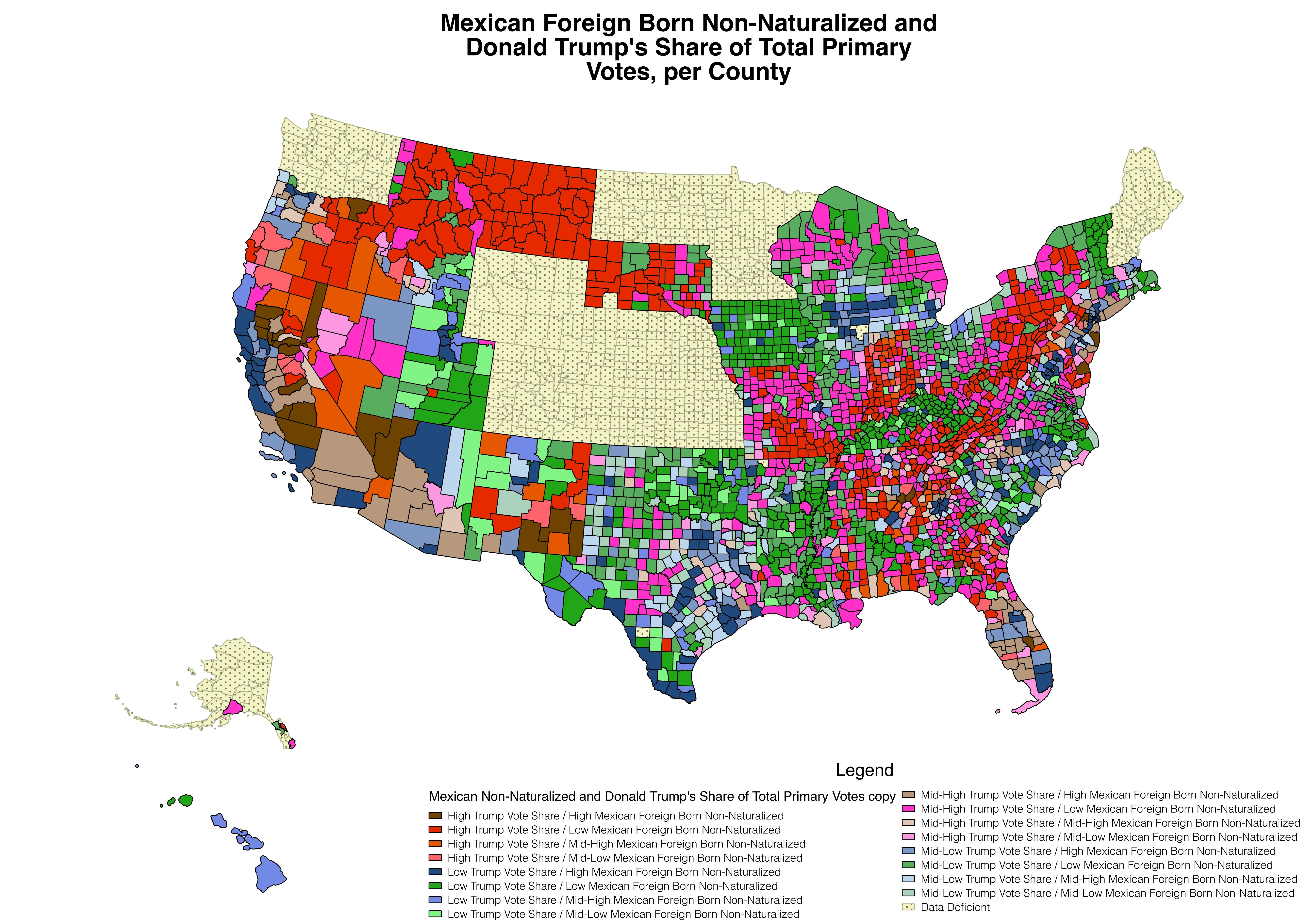
Many colours vs. Fewer colours

This chart uses a kaleidoscope of colors to differentiate the many time series. The designer likely opted for a legend because it would be impossible to directly label all the dense-packed time series. Text annotation of data is almost always a distraction for the audience. This chart communicates an unintelligible mess. Instead, design data visualizations to inform with only a few colors. In this example, some of the many time series can be eliminated and still arrive reasonably at the same conclusion. Perhaps some of the time series can be grouped logically into multiple charts. Text annotation of data, like these two boxes, is best deleted to avoid distracting clutter. The content of the annotation is better shifted to the speaker’s notes. The short, dashed line looks like it highlights a small aberration in the data to the detriment of the overall message. Eliminate distractions from your main message. Source: Calculated Risk
Misleading variable vs. Accurate variable

Deliberately charting a misleading variable is intended to deceive the audience. Whenever you’re considering deceiving your audience, stop and examine your motives. Often the motive for deception is to cover up or skate around a difficult message you don’t want to be identified with. A much better strategy is to acknowledge the problem with an accurate variable and then spend most of your presentation time detailing the strategy that will resolve the problem. Aside from the ethical issues, these charts are really boring. These charts can be improved by:
-Overlaying another relevant variable like margin or net income.
-Showing the revenue trend of a competitor.
-Providing a drill-down into revenue by division, product line or geographic area to show that parts of the company are performing reasonably.
Source: Yogi Schulz
No Motion vs. Motion
Incorporating motion into a data visualization is an excellent way to present time series data.
Presenting trends in your data is are always more powerful than showing only point-in-time data. Whenever you can add motion to your data, you will convey your message more effectively.
Source: CBC News
3D presentation vs. 2D presentation

This data visualization exhibits multiple problems:
-Rarely does a 3D presentation add any communication value over a 2D presentation of the data.
-Look carefully and you’ll notice that the right-most bar is much shorter than is suggested by its annotated value.
-The annotated text is shown vertically. That’s always a bad idea because it forces your entire audience to tilt their heads to read your chart.
You can greatly improve this data visualization by:
-Changing the chart type to a 2D presentation of the data.
-Ensuring that the lengths of all the bars is proportionate to the associated value.
-Changing the chart type to a horizontal bar chart to make the bar labels easy to read. Avoid a legend whenever possible.
Source: Rock Content
Omit some data vs. All the data

If your data only ambiguously supports the trend you want to present to support your recommendation, it’s tempting to create a fake trend by removing some of the data points. This action is a deliberate misrepresentation of the facts and is unethical.
The best solution to this problem is typically one or more of the following actions:
-Show the accurate representation of the data and then zoom in on the part of the chart that supports your point.
-Create a different data visualization with accurate data and perhaps a different chart type.
-Accept that your data doesn’t support your initial recommendation. Continue your analysis and identify data that supports a different recommendation.
Source: Cogent Legal
One busy visualization vs. Multiple clear visualizations
![]()
This busy map visualization shows petroleum pipelines in the USA. The chart offers a number of features:
-Pipelines are color-coded by operator name.
-Arrows indicate direction of product flow.
-The width of the arrows is proportional to pipeline length.
-The hover produces a small table of pipeline information depending on where the pointer is located.
-The small histograms at right provide an indication of volume shipped by operator name.
This map-oriented data visualization can be improved by:
-Adding pan and zoom controls.
-Increasing the size of the title at the top.
-Removing the distracting histograms at the right into a separate data visualization.
-Using the enormous empty space at bottom left better to adjust the operator color legend to three columns to make the text larger and therefore more easily readable.
Source: SAS Visual Analytics
Overloading a chart vs. Minimalist chart

This incredible compendium of pie charts brings together too many categories of data into a single visually confusing mess. There is a limit to the amount of data you should try to aggregate and that your audience can absorb at one time.
A better approach is to design a series of data visualizations that lead to your recommendation. It’s often useful to proceed as follows:
-Start with a chart about the big picture or context for your situation.
-Describe supporting data on multiple charts; one for each category of data.
-Bring forward conclusions from the preceding charts into a final chart that describes your recommendation.
Source: Information Today, Inc.
Confusing terminology vs. Consistent terminology

Consider these questions about this data visualization that challenge its effectiveness:
- Does this chart illustrate consumption or supply of oil?
- Does this chart show percent or fraction of oil?
- Is the phrase Imported Oil Fraction explanatory text or is it the label for the white area that is actually an invisible time series?
Here are the clarifications that will improve the data visualization:
- Consumption and supply are different. The difference is the volume of monthly opening and closing inventories. Pick the word that accurately describes your data.
- The Y-axis and subtitle both show percentage. Delete the word fraction because it’s confusing and redundant.
- Imported Oil Fraction is positioned on the area of the time series of imported oil volume from all countries other than Canada. Remove the word Fraction and color the area so that it doesn’t look empty.
Always check your data visualization for terminology consistency before you publish it. Similarly ensure terminology consistency in your presentation text that you will be delivering with the charts.
Source: EIA
Memorable data visualizations

The key elements of a memorable data visualization include:
- Ensure that the chart element that stands out visually conveys your central idea.
- Emphasize chart clarity to support communication clarity.
- Restrict chart to a small amount of related data.
- Use color sparingly but with high contrast.
- Use motion to show trends.
- Use a mouse hover to reveal details as illustrated above.
- Eliminate ornamentation.
- Label axes well.
- Create a prominent title and related subtitle.
- Ensure that a unit of measure is indicated for numeric values.
- Avoid a legend if possible.
- Ensure text and numbers are large enough to be easily readable.
- Never design a chart to mislead your audience.
For a more comprehensive list of considerations, click on Data Visualization ChecklistData Visualization Checklist.
If all this discussion of data visualization issues has made you unsure of what chart type is best for your data visualization and your audience, click on Chart Chooser to help you make the best choice.
What strategies would you recommend to help designers improve the data visualizations they create? Let us know in the comments below.
Source: FusionCharts